In the 1930’s the Home Owner’s Loan Corporation of America (HOLC) created actuarial maps of the United states. These maps were color coded — Green, Blue, Yellow, and Red — to reflect the amount of “risk” associated with home loans in those areas. The colors corresponded to “Best” (green), “Still Desirable” (blue), “Definitely Declining” (yellow), and “Hazardous” (red). Being in a green area made you likely to secure a federally-insured home mortgage, something that was effectively unavailable to red areas. Red areas were often associated with black populations, and these maps are where the term “redlining” comes from.
Here’s an HOLC map of Arlington, courtesy of the University of Richmond’s mapping inequality project.

Note that Arlington does not have any “Hazardous” (red) areas; 68% of the town fell into the top two grades, meaning that we were generally a safe bet as far as federal mortgage insurers were concerned. To the extent that the HOLC preferred white communities, Arlington seems to have fit the bill. According to US census data.
- 1930: population 36,094. No breakdown by race.
- 1940: population 40,013. 99.8% white.
- 1950: population 44,353. No breakdown by race.
- 1960: population 49,953. 99.7% white.
- 1970: population 53,524. 99.0% white.
- 1980: population 48,219. 97.3% white.
Today, Arlington is about 84% white. But during the time that mortgage approvals were based on the HOLC maps — the mid 1930’s through the mid 1960’s — we certainly qualified as an overwhelmingly (> 99%) white community.
Arlington had four yellow-lined (“definitely declining”) areas; about 32% of the town. C1 (on the western edge of town) was noted for an “infiltration of Jews”, a “heavy concentration of relief families”, and hilly terrain which was “not conducive to good development”. But it had good schools and a nice area along Appleton St. C2 (along Mass Ave and Mill Brook) was noted for “obsolescence” with “business and housing mixed together” and “railroad tracks through [the] neighborhood”. There was an infiltration of lower-class people, a moderate number of relief families, and “little possibility of conversion of properties to business use”.
C3 (East Arlington, around the present location Thompson School and Menotomy Manor) was noted for “Obsolescence, poor reputations” and “foreign concentration”. There was an “infiltration of foreign [residents]” and a “heavy concentration of relief families”. On the positive side, there were “a few small farms in this section of high grade development of the ground [which] may be anticipated in the early future with modest houses”.
Finally, C4 (around Spy Pond, and near the Alewife T station) was “obsolescent”, with an infiltration of foreign families, and a moderately heavy concentration of relief families. The HOLC noted that “Houses East of Varnum Street [and] south of Herbert Road are built on low ground and many have damp basements which makes them difficult to keep occupied”.
That’s what the HOLC saw as the declining side of Arlington: Jews, foreigners (mostly Italian), relief families, obsolescence, damp basements, and proximity to the Boston-Maine railroad.
Exercise for the reader. Arlington has five public housing projects: Drake Village, Winslow Towers, Chestnut Manor, Cusack Terrace, and Menotomy Manor. What HOLC colors are associated with our public housing?
Buildings last for decades, and effects of the HOLC’s underwriting policies are still with us today — sometimes in unexpected ways. A 2020 paper called “The Effects of Historical Housing Policies on Resident Exposure to Intra-Urban Heat: A Study of 108 US Urban Areas” examined 108 communities, and tried to determine if there was a relationship between redlined areas and urban heat islands. Nationwide, this is what they found:
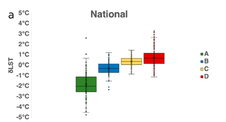
LST stands for “land surface temperature” and shows how different HOLC risk categories compare to the overall temperature of a region. Green areas tend to be cooler, with less paved surface, more extensive tree canopies, and buildings with reflective exteriors. Red areas are warmer with more paved surfaces, less tree canopy, and building exteriors that absorb and release heat (e.g., brick and cinderblocks). While the degree varies across different parts of the country, the general trend is the same: as one goes from green to red, the surface temperature goes up. Formerly-redlined areas are far more likely to contain heat islands.
Exercise for the reader. Are there heat islands in Arlington? What (HOLC) color are they?
As the global temperature warms, Arlington (like many other communities) will have to contend with heat islands. The treatment is likely to be area-specific, following patterns laid out in the HOLC’s maps from the early-20th century.